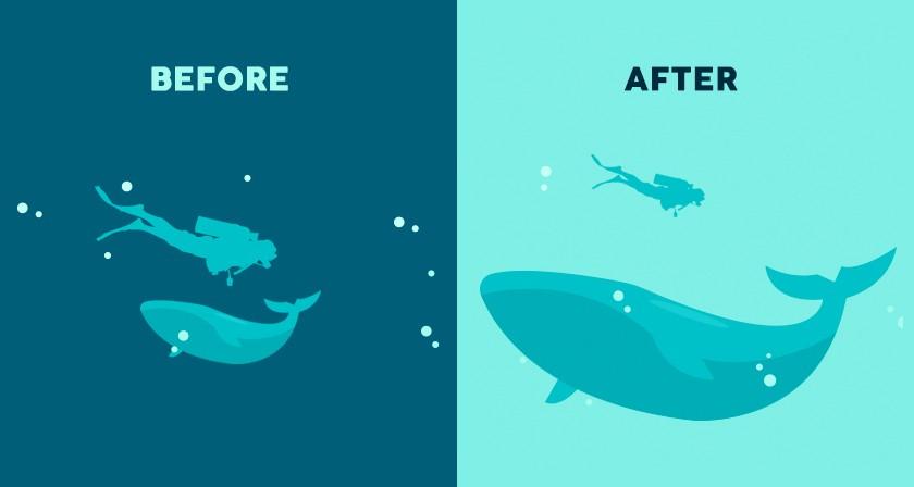
The Power of Visual Hierarchy in Design
In the world of design, visual hierarchy is an indispensable principle that shapes how users perceive, navigate, and interact with content. Whether you’re working on a website, mobile app, or printed material, mastering visual hierarchy can drastically improve user engagement and communication effectiveness. This article explores the power of visual hierarchy in design, its key benefits, practical tips to implement it, and real-world applications.
What Is Visual Hierarchy in Design?
Visual hierarchy refers to the arrangement and presentation of design elements in a way that guides viewers’ attention in order of importance. It’s about prioritizing information so users naturally see the most critical parts first and then move through the content logically.
Designers use various tools such as size, contrast, color, spacing, and typography to establish a clear path for the eye, making the content more digestible and improving the overall user experience (UX).
Why Is Visual Hierarchy Important?
- Improves readability: Helps users quickly scan and understand content without feeling overwhelmed.
- Enhances user experience: Guides users smoothly through the interface, reducing cognitive load.
- Increases conversions: Highlights calls to action and important messages leading to better engagement and sales.
- Builds brand clarity: Consistent use of hierarchy strengthens brand identity and trust.
Core Elements That Shape Visual Hierarchy
To create an effective visual hierarchy, designers manipulate several design attributes. Here’s a concise breakdown of the most critical elements:
| Element | Effect on Hierarchy | Usage Example |
|---|---|---|
| Size | Larger elements draw more attention | Headline is twice the size of body text |
| Color | Bright or contrasting colors stand out | Call-to-action buttons in vibrant red |
| Typography | Font weight and style convey importance | Bold fonts for subheadings, italics for quotes |
| Spacing | Whitespace groups and separates content areas | Clear separation between sections and paragraphs |
| Alignment | Consistent alignment creates flow and order | Left-aligned text for easy reading |
| Visual Cues | Icons, arrows, and images direct attention | Arrow icons pointing to sign-up forms |
Benefits of Using Visual Hierarchy in Your Designs
Implementing a strong visual hierarchy brings numerous advantages for designers, businesses, and users alike:
- Faster Information Processing: Users don’t need to wade through clutter; hierarchy simplifies complex data.
- Engages Audience Effectively: Captivates attention where it matters most, reducing bounce rates.
- Supports Accessibility: Clear hierarchy aids users with visual impairments or cognitive challenges.
- Streamlines Decision Making: Prioritized content helps users make faster, more informed choices.
- Boosts SEO: Well-structured content with proper headings improves search engine indexing and ranking.
Practical Tips to Create Strong Visual Hierarchy
Ready to implement visual hierarchy in your next project? Here are some actionable tips to get you started:
- Use size strategically: Make primary headings noticeably larger than secondary content.
- Apply contrasting colors: Highlight important elements with colors that stand out but complement your palette.
- Leverage typography variations: Utilize different fonts, weights, and styles to differentiate information.
- Break content into chunks: Use paragraphs, bullet points, and spacing to avoid overwhelming users.
- Include visual anchors: Incorporate images, icons, or charts that help convey key points instantly.
- Align consistently: Maintain consistent alignment to create a smooth visual flow.
- Test and iterate: Use A/B testing and heatmaps to refine what hierarchy works best for your audience.
Case Study: How Visual Hierarchy Transformed a Landing Page
Let’s look at a practical example. An e-commerce company needed to increase sign-ups for their newsletter from a landing page that was cluttered and confusing.
- Before: The page had equally sized fonts, similar colored buttons, and no clear focus area.
- After applying visual hierarchy:
- Headline was enlarged with bold typography and a contrasting color.
- Call-to-action (CTA) button was bright red and centrally positioned.
- Supporting text was broken down into bullet points with clear spacing.
- Directional arrows and icons subtly pointed towards the CTA.
Result: Newsletter sign-ups increased by 38% within a month due to the clearer path and engaging call to action.
First-Hand Experience: Visual Hierarchy in Everyday Use
As a designer, I’ve found visual hierarchy to be the backbone of effective communication. One client website was suffering from low user engagement and high bounce rates. After revamping the homepage with clear headings, well-spaced sections, and strategically colored CTAs, the visitors spent more time exploring and conversions improved noticeably. It’s proof that even subtle hierarchy tweaks can yield powerful results.
Summary Table: Visual Hierarchy Do’s and Don’ts
| Do’s | Don’ts |
|---|---|
| Use scale to emphasize key content | Make everything the same size and weight |
| Choose contrasting colors for important elements | Overuse bright colors causing visual chaos |
| Break text with whitespace | Crowd elements without spacing |
| Test hierarchy with real users | Assume hierarchy works without feedback |
| Keep alignment consistent | Randomize placements with no logical order |
Conclusion: Unlock the Potential of Your Designs with Visual Hierarchy
Visual hierarchy is more than just a design buzzword – it’s the fundamental structure that can transform a chaotic interface into a clear, engaging, and user-friendly experience. By mastering the principles of visual hierarchy, designers and businesses alike can enhance readability, boost user engagement, and increase conversion rates. Whether you’re a seasoned designer or just starting, prioritizing visual hierarchy will elevate your projects and communicate your message more effectively. Start implementing these principles today and see the difference it makes in your design workflow and results.


