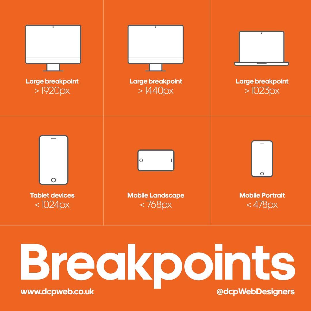
The Importance of Mobile-Responsive Design in 2025
In today’s fast-evolving digital landscape, mobile-responsive design is no longer optional-it’s essential. As we step further into 2025, the role of mobile-friendly websites continues to escalate, affecting everything from user experience (UX) to search engine rankings. Businesses that fail to prioritize mobile responsiveness risk losing a significant share of their online audience and falling behind competitors.
What is Mobile-Responsive Design?
Mobile-responsive design is the practice of creating web pages that automatically adjust and optimize their layout, images, and content based on the device being used-whether it’s a smartphone, tablet, or desktop. The goal is to provide a seamless, intuitive experience regardless of screen size or device capabilities.
Why Is Mobile-Responsive Design Crucial in 2025?
Here are the primary reasons mobile responsiveness matters more than ever in 2025:
- Explosive mobile usage: Over 60% of all global web traffic now originates from mobile devices, a statistic that’s expected to rise.
- Google’s mobile-first indexing: Google predominantly uses the mobile version of websites for indexing and ranking, making responsive design critical for SEO success.
- Enhanced user experience (UX): Sites that adapt seamlessly to smartphones reduce bounce rates and increase engagement.
- Competitive advantage: Mobile responsiveness is often a deciding factor for users comparing brands online.
- Boost in conversion rates: Optimized mobile designs improve user journeys, leading to higher sales and leads.
Benefits of Mobile-Responsive Design in 2025
| Benefit | Description | Impact on Business |
|---|---|---|
| Improved SEO Rankings | Mobile-friendly sites rank better on Google due to mobile-first indexing. | Higher organic traffic and visibility in search results. |
| Faster Loading Times | Responsive sites are optimized for speed on all devices, reducing loading delays. | Better user retention and reduced bounce rates. |
| Increased Reach | Accessible on any device, reaching a wider audience globally. | Expanded market potential and brand awareness. |
| Consistent Branding | Uniform design elements across devices strengthen brand identity. | Enhanced customer trust and loyalty. |
| Easier Maintenance | Single site for all devices reduces development and update efforts. | Cost savings and quicker implementation of changes. |
Practical Tips for Implementing Mobile-Responsive Design in 2025
Building or updating your website with mobile responsiveness in mind can be streamlined by following these best practices:
- Use a fluid grid layout: Design your page with flexible grids that adapt to screen widths instead of fixed pixel layouts.
- Optimize images: Use modern formats like WebP and leverage image compression to ensure speedy loading on mobile devices.
- Prioritize content hierarchy: Place the most important information and calls to action prominently on smaller screens.
- Test across multiple devices: Use browser tools and real devices to ensure consistency and usability.
- Leverage responsive frameworks: Consider WordPress themes or frameworks like Bootstrap or Elementor, which come mobile-ready out of the box.
- Optimize fonts and buttons: Ensure text is legible and tappable areas meet accessibility standards for touchscreens.
Case Study: How Mobile-Responsive Design Boosted Sales for a Retailer
Let’s look at an example from a mid-sized online retailer who revamped their site for mobile responsiveness in early 2024.
- Challenge: High bounce rate on mobile at 65%, low conversion rate of 1.2%.
- Solution: Implemented a fully responsive WordPress theme, optimized images, and simplified mobile navigation.
- Outcome: Mobile bounce rate dropped to 35%, and mobile conversion increased threefold to 3.6% within six months.
This case clearly illustrates how mobile-responsive design can dramatically impact user engagement and revenue.
Future Trends in Mobile-Responsive Design to Watch
As we advance in 2025, here are some emerging trends shaping the future of mobile-responsive design:
- Progressive Web Apps (PWAs): Combining the best of websites and apps, PWAs provide app-like experiences that are fast, reliable, and engaging on mobile devices.
- Voice Search Optimization: Designing interfaces that accommodate voice commands and conversational navigation for mobile users.
- AI-Powered Personalization: Using machine learning to automatically tailor content layouts per individual mobile users’ preferences.
- 5G-Enhanced Experiences: Faster mobile networks will allow for richer media, animations, and interactive content without sacrificing speed.
Conclusion: Don’t Ignore Mobile-Responsive Design in 2025
In 2025, a mobile-responsive website is fundamental to online success. From improving SEO rankings to fostering better user engagement and boosting conversion rates, the advantages are undeniable. Businesses must embrace mobile optimization as a core part of their web development strategy to stay relevant and competitive in today’s mobile-first world.
Whether you’re launching a new website or updating an existing one, prioritizing mobile responsiveness will future-proof your digital presence and unlock new growth opportunities.
Start today by auditing your current site’s mobile-friendliness and applying the practical tips outlined above – your customers (and Google) will thank you!


