Choosing the Best Fonts for Web Readability: A Complete Guide
When it comes to creating an engaging and user-friendly website, choosing the best fonts for web readability ranks high on the list of priorities. Fonts not only shape how your content is perceived but also impact user experience, time spent on site, and even search engine rankings. In this comprehensive guide, we’ll explore how to select readable fonts, the benefits of great typography, practical tips, and best practices to help you optimize your web design and boost SEO.
Why Font Readability Matters for Websites
The right font choice can make or break the readability and accessibility of your website. Here’s why readability is crucial:
- Improves User Experience: Easy-to-read fonts reduce eye strain and keep visitors engaged longer.
- Enhances Content Clarity: Clear typography ensures your message is understood quickly without confusion.
- Boosts SEO: Readable fonts correlate with higher user retention and lower bounce rates, signals favored by search engines.
- Supports Accessibility: Proper fonts assist users with visual impairments or dyslexia, fostering inclusiveness.
Key Factors to Consider When Choosing Fonts for Web
Not all fonts are created equal, especially in online contexts. Let’s break down the main factors that affect web font readability:
1. Font Type: Serif vs Sans-Serif
Serif fonts feature small decorative strokes at the ends of letters, while sans-serif fonts are clean without these accents.
- Serif Fonts: Traditionally used in print, they convey elegance and formality. Some studies suggest serif fonts improve readability in long paragraphs on print but may be less ideal on screens.
- Sans-Serif Fonts: Currently preferred for web content due to their simplicity, clarity, and modern appeal.
2. Font Size and Line Height
Font size and spacing significantly enhance readability:
- Standard body text size ranges from 16px to 18px for desktop.
- Line height (leading) between 1.4 and 1.6 times the font size prevents text from feeling cramped.
3. Contrast and Color
High contrast between text and background color improves legibility. Avoid using low contrast combinations like light gray text on white backgrounds.
4. Font Weight and Style
Use standard font weights (normal to bold) and avoid decorative styles for body text to prevent distractions.
5. Responsive Typography
Fonts must adjust seamlessly to various screen sizes. Use relative units like em or rem instead of fixed px values for flexible scaling.
Top Fonts Recommended for Web Readability
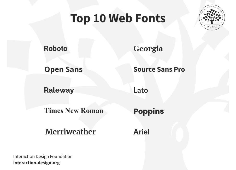
Here’s a handy table featuring some of the best fonts trusted by designers and developers worldwide for clear and readable web content:
| Font Name | Category | Best Use Case | Popular For |
|---|---|---|---|
| Roboto | Sans-Serif | Body Text & UI | Google’s web projects & Android apps |
| Open Sans | Sans-Serif | Body Text & Headlines | Corporate websites & blogs |
| Lato | Sans-Serif | Body Text & Headlines | Business & portfolio sites |
| Merriweather | Serif | Long-Form Articles | Editorial websites & news |
| Georgia | Serif | Readable Headlines | Blogs & content-driven sites |
| Nunito | Sans-Serif | User Interfaces & Forms | Modern startups & tech sites |
Benefits of Using Readable Fonts on Your Website
Making smart font choices can yield multiple benefits beyond aesthetics:
- Increased Engagement: Visitors find content easier to consume and are more likely to stay longer.
- Improved Conversion Rates: Clear communication minimizes friction in user journeys.
- Stronger Brand Identity: Consistent typography builds a recognizable and trustworthy appearance.
- Better Accessibility Compliance: Meets WCAG standards for visually impaired users.
Practical Tips for Optimizing Font Readability on the Web
- Stick to Two or Three Fonts: Too many font families confuse users and reduce consistency.
- Use Web-Safe or Google Fonts: Ensure fonts load quickly and appear consistently across devices.
- Test on Multiple Devices: Check readability on desktops, tablets, and smartphones.
- Avoid All Caps for Large Blocks of Text: Caps can slow reading speed and reduce comprehension.
- Use Proper Hierarchy: Differentiate headings and body text by size and weight to guide readers.
- Leverage CSS for Accessibility: Use properties like
font-feature-settingsandtext-renderingfor smoother text.
Case Study: How Font Choice Boosted Readability on a Blog
One popular tech blog recently revamped its typography by switching from a decorative serif to a clean sans-serif font family (Open Sans). They also adjusted font size from 14px to 16px and increased line height. Within three months:
- Average session duration increased by 25%
- Bounce rate decreased by 18%
- User feedback on readability improved drastically
This case illustrates how thoughtful font selection directly impacts user engagement and SEO performance.
First-Hand Experience: Choosing Fonts for My Website
Personally, when I designed my portfolio site, I prioritized readability by selecting Roboto for body text and paired it with Merriweather for headings. I followed these best practices:
- Consistent font sizes and weights for different content areas
- Sufficient padding and spacing between lines and paragraphs
- Maintained high contrast by using dark text on a white background
The result was a sleek, approachable website that visitors praised for its ease of reading, ultimately increasing contact requests and subscriber growth.
Conclusion: Elevate Your Website with the Right Fonts
Choosing the best fonts for web readability is a vital component of successful web design that directly influences user experience, accessibility, and SEO. By selecting well-crafted, legible fonts and applying thoughtful typography practices, you invite visitors to stay longer, comprehend clearly, and engage deeply with your content.
Remember to test different fonts and sizes on real devices, focus on contrast and spacing, and prioritize simplicity over decorative styles. With these strategies in place, your website’s typography will transform from a mere design element into a powerful tool for communication and growth.
Start optimizing your font choices today to create a seamless reading experience and watch as your website performance and user satisfaction soar!


